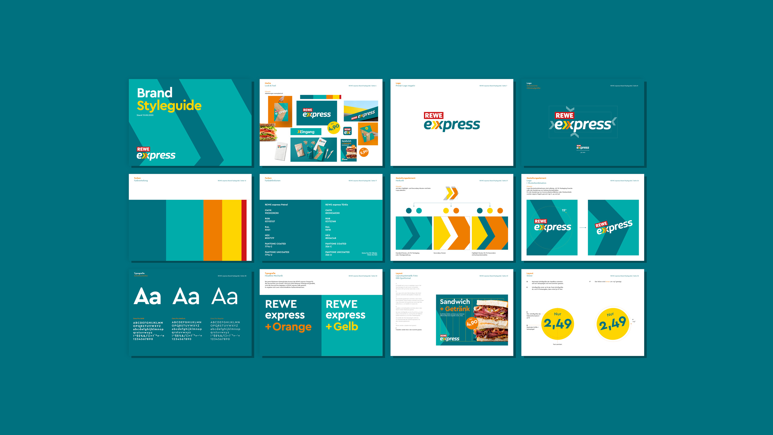

Developing a corporate design, including documentation in the form of a style guide, for the new convenience stores operated at gas stations by grocery chain REWE.
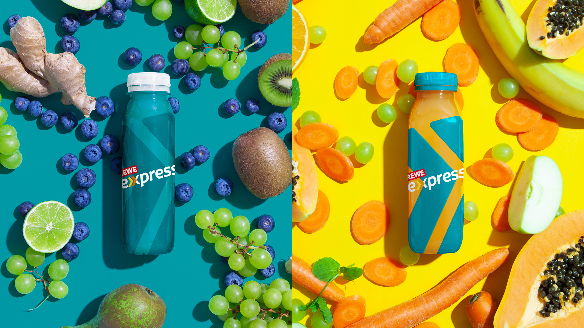
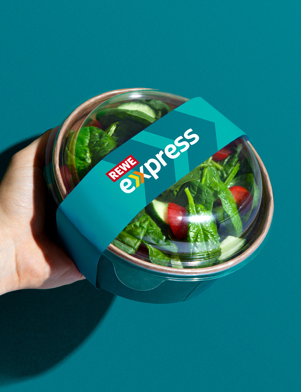
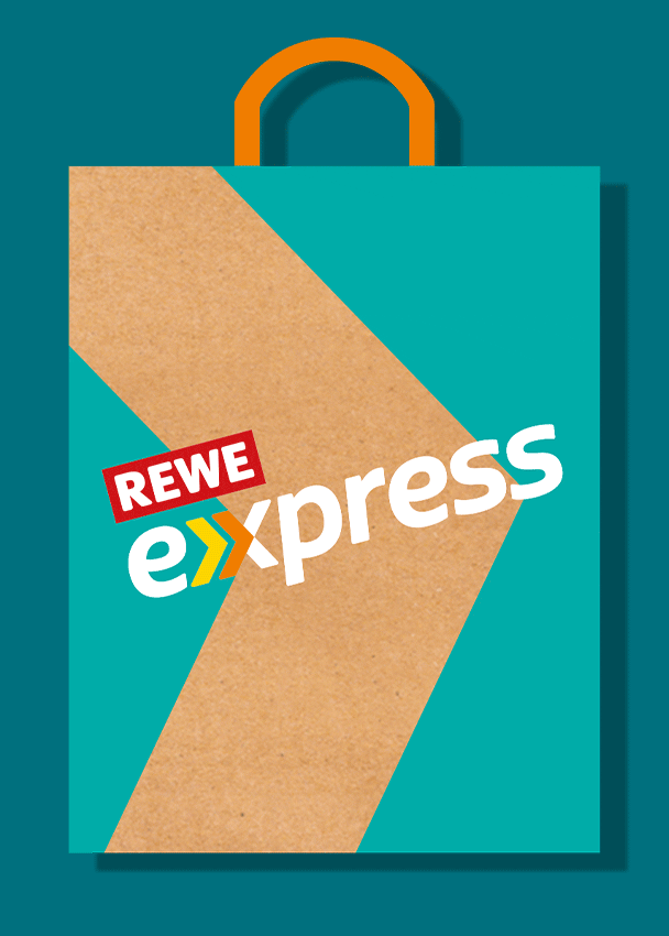
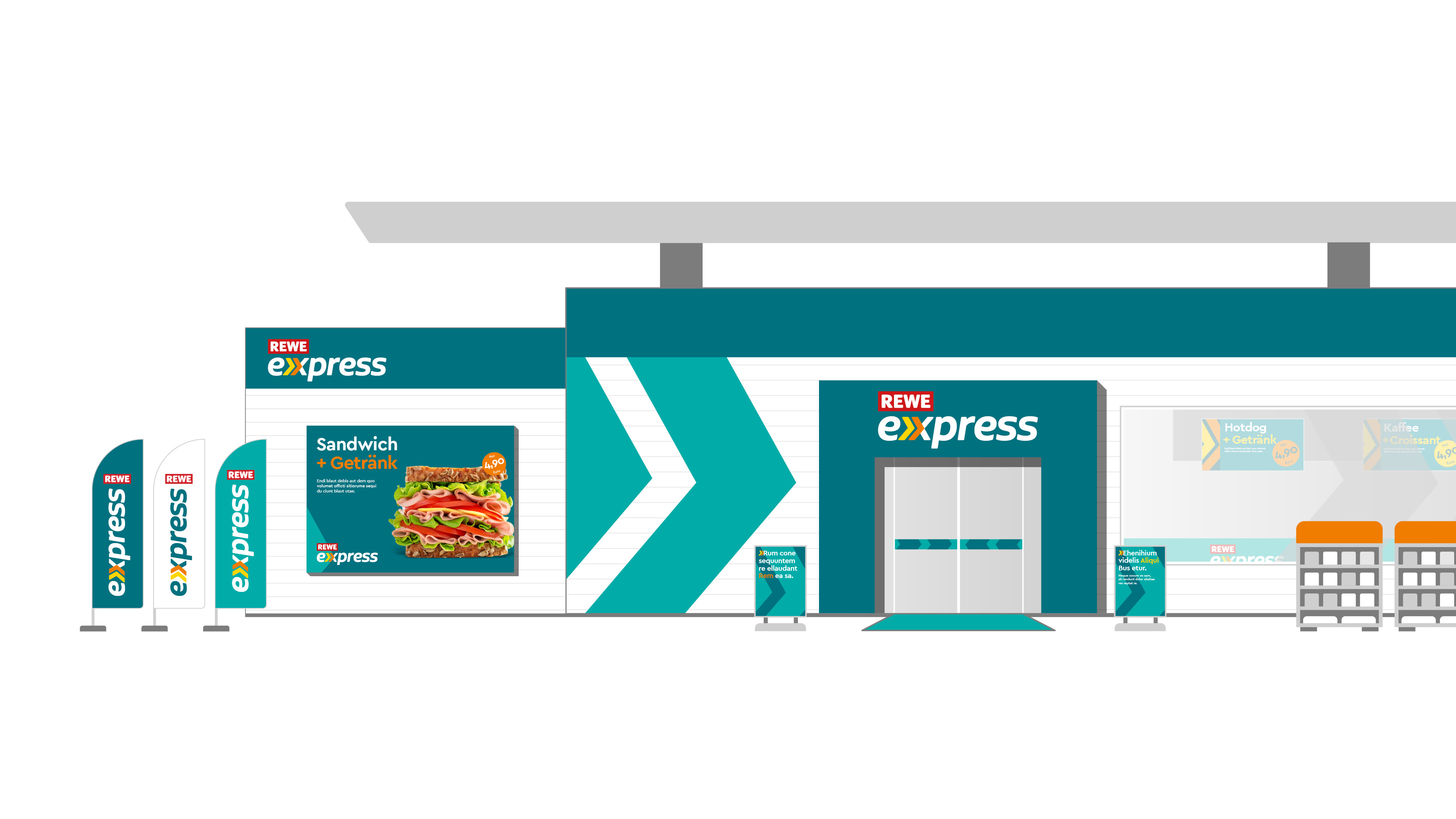
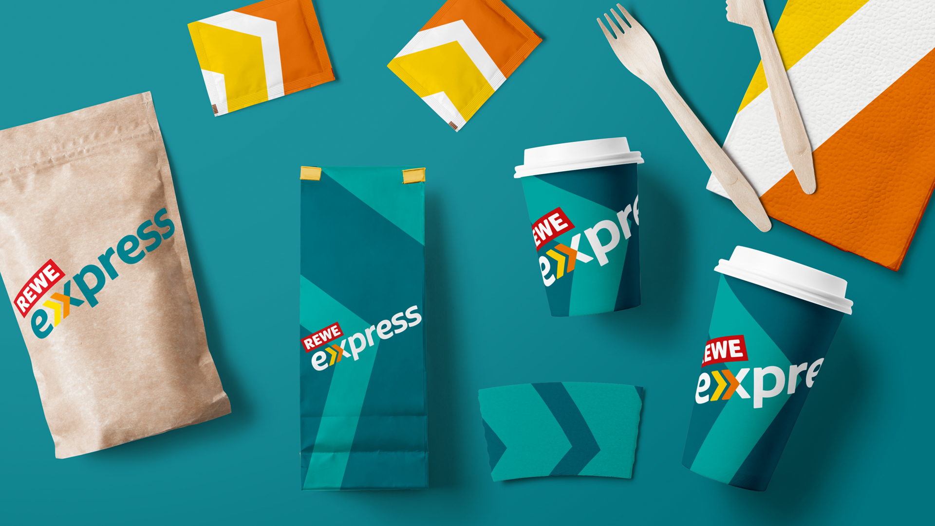
loved developed a corporate design attuned to the new REWE express shop concept aimed specifically at customers who are very short of time and shop on the go.
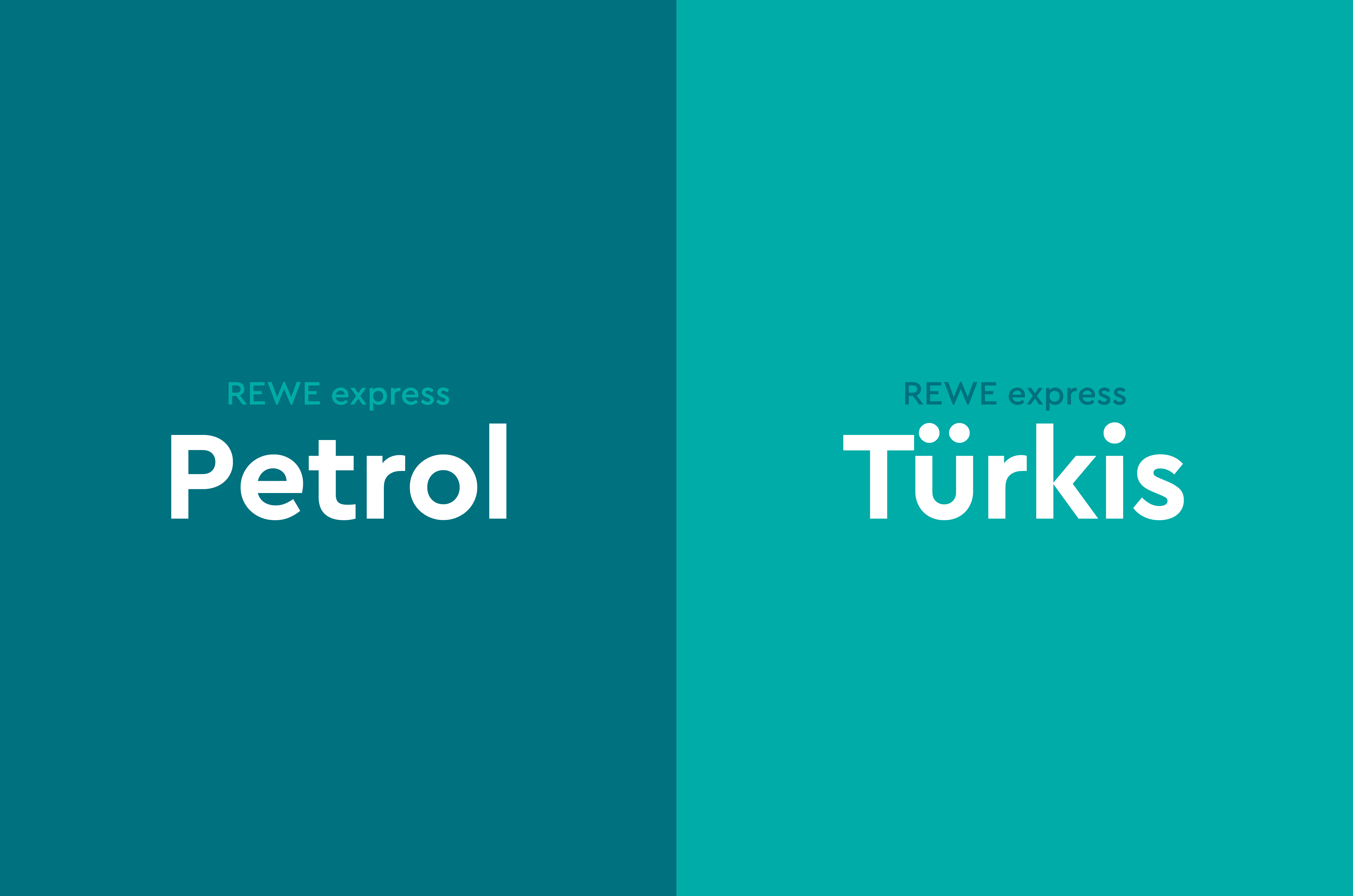
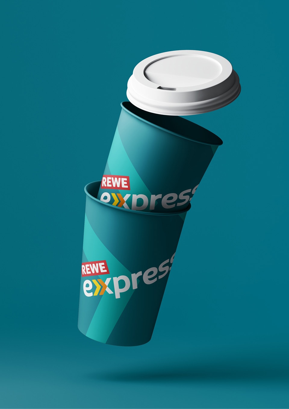
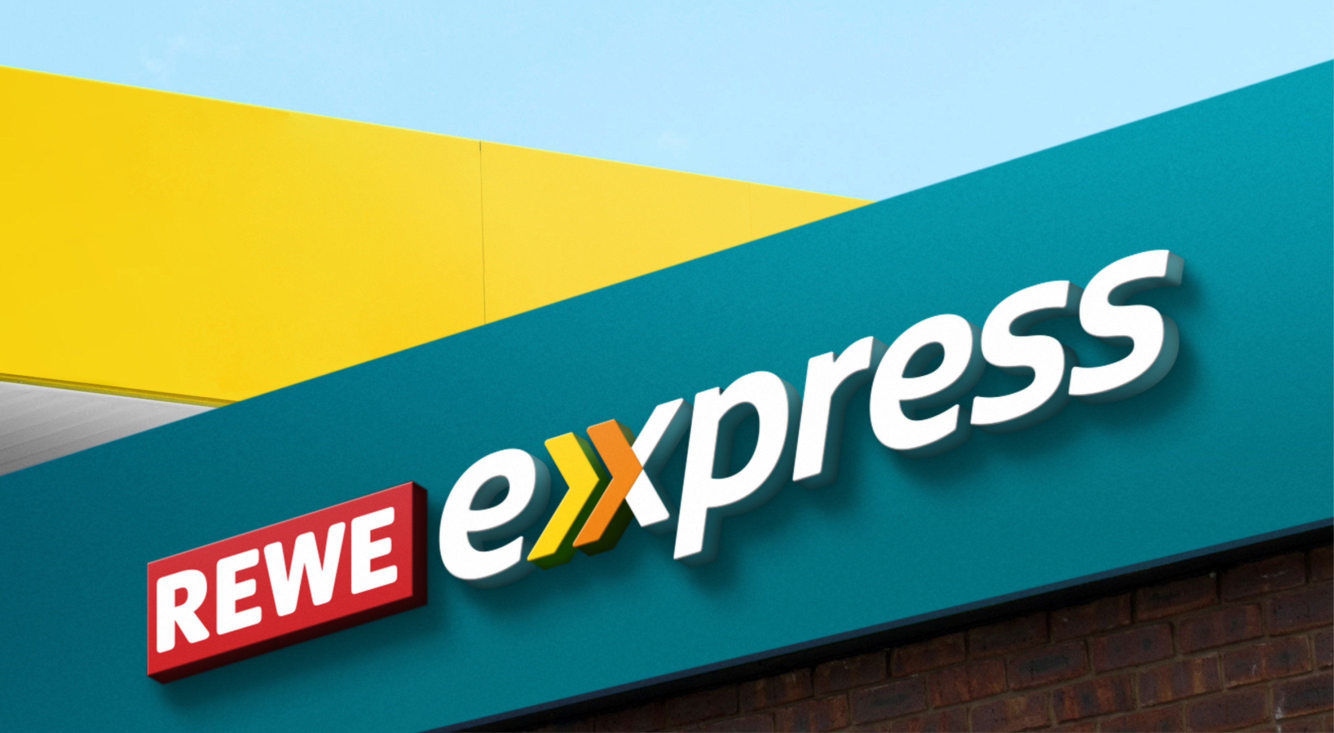
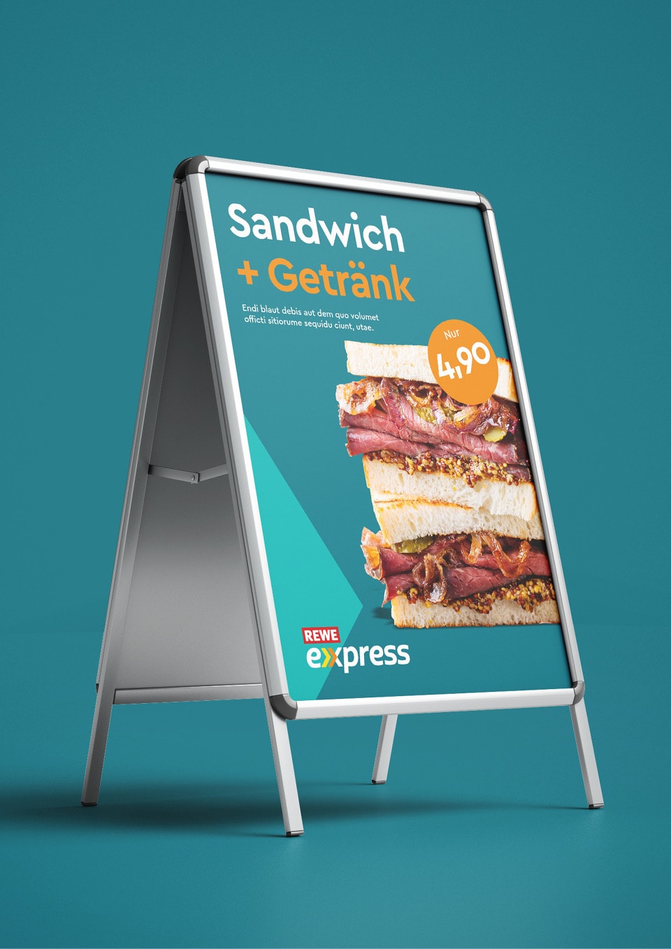
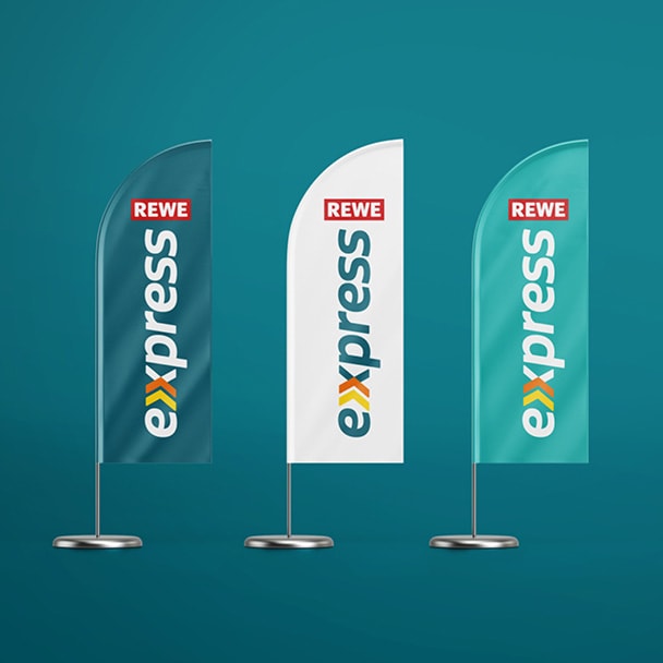
Featuring a bold arrow system that is as arresting as it is simple, the design holds its own in the gas station environment. It is also easily identifiable at a glance when driving past and conveys the aspects of movement, speed and convenience. The easy-to-use logo lends itself flexibly to various application options. In keeping with the gas station theme, the design is dominated by the color petrol.